I would like to replace the aged LuCI icons with modern SVG versions in order to have sharper graphics on higher resolution screens and to be able to better blend in the icons with light and dark color palettes.
Can anyone suggest Apache license compatible icons which would be a good fit or is there maybe someone with a little bit of SVG drawing talent willing to create new icons?
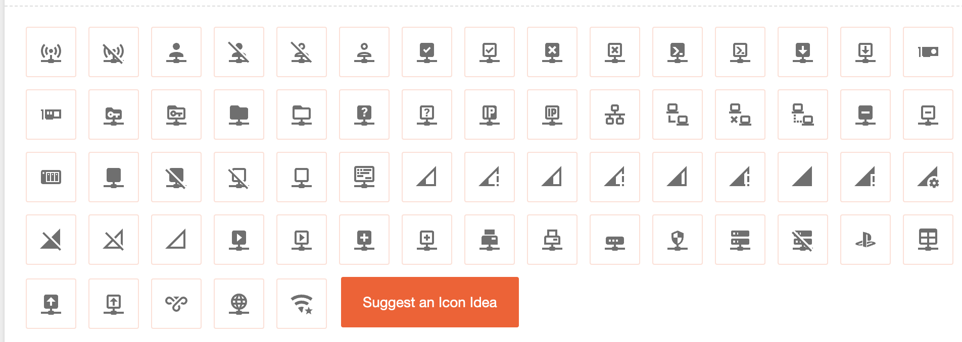
These are the icons I want to replace:
Wired ethernet port, disconnected
Wired ethernet port, connected
Simple ethernet interface (e.g. eth0)
Alias interface (e.g. @wan)
Bridge interface (e.g. br-lan)
Switch port / VLAN interface (e.g. lan1 or eth0.100)
I think using https://materialdesignicons.com/ would be your best option. They have covered a number of use cases (e.g. Home Assistant uses this icon set extensively), and can easily combine/overlay multiple elements to indicate various things.
Signal icons are unfortunately 3-stage instead of 4, so I'm not sure if it can be used properly.
But the best part is, you can create subset fonts easily, even via a REST API, so it could be easily incorporated into the build system, without taking up too much space, and even luci plugins could call into the existing font, similar to how HA does it (e.g. in Home Assistant you can tell the system to use mdi:light as an icon, the same could be done with LuCI, and the user/theme could replace the font with different variants or alternatives without breaking things). Plus it also has plethora of device icons, which could be useful for more detailed network client analysis, similar to how Unifi can display different icons/images for devices.
Hi @peternikolow - thanks for the offer. Unfortunately I don't have access to the high res originals anymore, some of these icons also were manually created by cutting and pasting bits together, then manually downscaling and optimizing the color palette to achieve the smallest possible file size. Afair the icons were based on a Gnome network manager icon theme, but I forgot which one.
@fonix232 - good idea. Although I was thinking about multi colored icons as standalone .svg files. But given the flexibility, I maybe should revisit the icon font approach and do a quick mockup on how monochrome line-art icons would look like compared to the current ones...
If you use layered/combined icons with tint, you can add a "splash" of colour to the icons, while also allowing the theme to define its own - e.g. the new OpenWrt2020 theme could tint the base Ethernet port icon blue, and a small dot on it could indicate status (gray - unplugged, orange - 100M, green - 1000M, blue - 2.5Gbps, etc.). Same goes for wireless, you can use the base disabled in gray, and add the cross-out (which is already present on the base icon) in red, to make it more prominent. You can do a lot with font based icons that make the approach more dynamic, and most icon font sets support multiple layers for tinting purposes.
They have the alternative bar representation for signal, although I think mixing this one which I think is traditionally associated with cellular service with the WiFi would be a bit odd. Personally, I don't see a big issue by using only 3 bars for the WLAN, especially if the percentage and dBm readings are still available for experts (we don't use bars anyway). The main goal seems to be a nice looking and consistent icon set, no? The only icon I am not seeing is one for multiple switch ports, but maybe some CSS magic can be used to overlay icons?
I agree the "Material Icons" set supplies a good baseline for what the icons can be like. But pretty much all of the icons we need are missing, or at least not fitting very well. But that's okay, they can be created, SVG icons to fit on a 24x24 raster are not rocket surgery.
So here's icons for "ethernet", "tunnel", "switch", and "bridge". I'm not so fond of the "key" metaphor for a tunnel device, I went for the "keyhole" metaphor instead. And I struggled quite a bit to find a visual metaphor for the bridge interface, I ended up creating a "bracket" of sorts around individually connected ethernet ports.
Rendered to 48x48 for more visual detail (and also to see how they do on hi-res screens):
And rendered to the target 24x24 size:
Feedback would be appreciated before I put effort into creating the other ones.
Sidenote: The material icon's SVGs are ... weird. Ostensibly they were created to fit on a 24x24 raster, adhering to Google's Material Icons guidelines. But they don't fit the raster very well. I suspect that's because they were "upscaled" to an uneven 320x320 and afterwards, for compression, had some decimal places shaved off. I had to recreate their basic form from scratch.
P.S.: Yes, I know, this is not what an RJ45 port actually looks like. However, if you execute it with more realistic proportions and features, it tends to shrink down from an accurate representation
into an indistinguishable blob in smaller sizes like 24x24:
... that actually looks much closer to an onigiri than an RJ45 port.
Seconded, the existing icons are 16x16 which is really very tight for any kind of clear detail, can we step up to 24x24 (including padding) or 20x20 (without padding)?
