On Top Left corner of the Forum on can find an access button called
My Posts
I think it would be quite useful to add a button called
My Topics
The new button could also be added to the menu available when the avatar is clicked, just with the other flag icons like, bookmark and others.
1 Like
I just added this to the side bar menu / 'hamburger' menu. Give it a shot.
Also, you can reach it by navigating to:
https://forum.openwrt.org/my/activity/topics
1 Like
That is really weird:
I have both 'My Posts' and 'My Topics' in the left column/side bar above the hamburger .
Does it look like something is wrong, or just different than expected/described? Did the My Posts do that before, or did that change as a result of me changing the settings?
They have always been there and I have no recollection of taking action to show them.
They look and work fine.
Awesome !
It works perfect. Now we can better sort through our own topics.
What do you call "the Hamburger" anyway ?
You may mistake it with "My Posts" which is different for it shows all interactions with other topics. My own guess.
Three dots or lines on top each other.
Depends on implementation
1 Like
The 3 horizontal lines is often called a hamburger menu, at least in US English. I'm referring to this icon in the upper left of the forum (as rendered in a desktop browser; it is on the upper right for mobile browsers, to the left of the avatar).
If your problem is solved, please consider marking this topic as [Solved]. See How to mark a topic as [Solved] for a short how-to.
Thanks! 
Not that it is a problem, but it sure is solved .
thanks
1 Like
Honestly, I do not use them but they are both there and they are not duplicated below the hamburger; despite @psherman's edit.
Maybe it is a Brave browser thing.
Could be. Do you have other browsers to try?
Yes, I am on Brave. But who cares where the buttons are.
functionality is king 
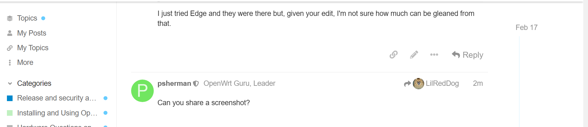
I just tried Edge and they were there but, given your edit, I'm not sure how much can be gleaned from that.
Can you share a screenshot?
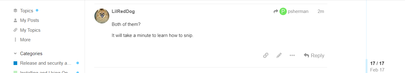
Both of them?
It will take a minute to learn how to snip.
This is what I see on Chrome:
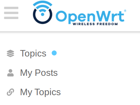
That looks normal, unless I'm missing something. The More category (with 3 vertical dots) is below My Topics but the hamburger menu (3 horizontal lines) should theoretically be above all of that (just out of view in your screenshot)