Hi all, I've started earlier today with a friend to rework the OpenWrt download page since it's a bit clumsy to find things. My overall idea is to adopt the 2020 redesign and also integrate parts of the functionality of the firmware wizard into the page, if (and only if) JavaScript is enabled.
The file structure should stay the same as before, I'm just trying make it visibly more pleasant.
I'd be curious if other people try to archive something similar and what their ideas of changes would be.
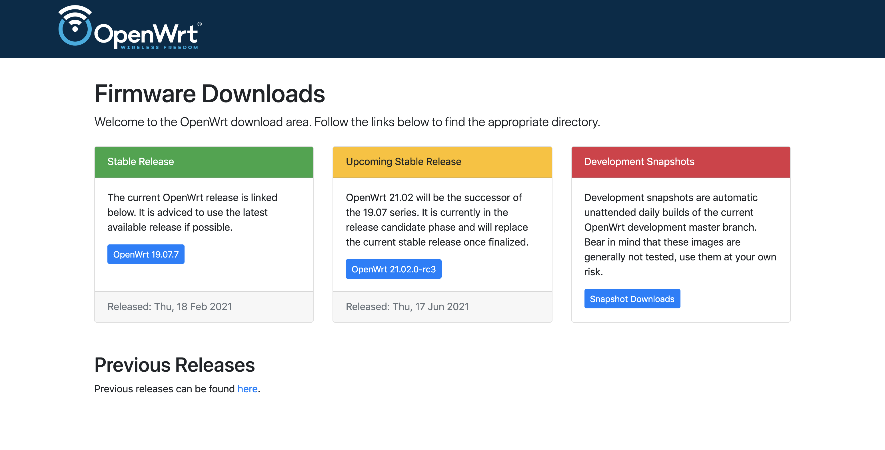
I am glad you're looking at this. The current https://openwrt.org/downloads page (which I assume this would replace) has always been a real grab-bag of topics that were in some way related to "downloads". (At least, I felt that way when I originally worked on it.) I also like use of color as an indication of "safety". Some other questions/thoughts:
I couldn't tell from the mockup how would this integrate the Firmware Selector (firmware-selector.openwrt.org) and the new, improved Imagebuilder (chef.libremesh.org) Perhaps there could be a place to type in the router info within the Stable Release box?
How would this page look when we don't have a RCx release (say, we just released 21.02...)
Placing the Release, RCx, Dev builds at the same "visual level" makes them appear equally important to the OpenWrt "audience". I wonder if we want to emphasize the current Stable by making it the major item at the top of the page. That would give us space to describe the beauty of the current release version, its major features, etc. We can then list RCx, Development builds, and even Previous Builds a little farther down.
My idea was that you click on whatever release you'd like and (if JavaScript is enabled) a little text input appears on top of the release page allowing to enter the device name.
The "improved" ImageBuilder would require official recognition before it becomes integrated anywhere. Since it requires more logic than a simple search search through JSON I'd leave it separated for now.
The middle box could simply be removed and snapshots on stable are next to one another.
Sounds good to me. I'll work on a redesign of the boxes.
You need to be aware of what effects colour-blindness might have, which are different to what just a monochrome monitor or a desaturated image might do.
Even if the green, yellow and red -including the white/ black text on top of the coloured fields- would disappear completely[0], a catchy and explicit description of each release is still underneath in black on white. Out of curiosity, what problems would you envision with the mockup page above - respectively how would you solve them in a better way?
While hard to tell from a mockup image, the resulting page shouldn't pose much of a problem to screenreaders either - no fuzz, no reliance on pixel images.
It is very hard for designers not specifically trained for accessibility issues to notice potential problems (early enough or at all), so I'm really curious what would be an issue with the mockup above? I wouldn't expect the directory-browsing enabled representation of the download site to go away either, as the above seems to me more targeted at providing a shortcut to the casual user, rather than replacing https://downloads.openwrt.org/ altogether.
--
[0] and at least the two colour blindless simulators I could locate on the web suggests that in either way the text remains fully readable, just the surrounding colours go through several different permutations (depending on the chosen filtering for deutanopia, protanopia, tritanopia or achromatopsia) - weird, but nothing that should surprise or confuse a person with these conditions.
This page could include a link to send users to the firmware selector page. It is such a useful tool, but someone who has landed here might not know it exists.
I'm not sure where these currently sit in terms of the "official recognition" and such, but I'm not seeing these in the mockup (unless they would sit behind the links to current and previous stable).
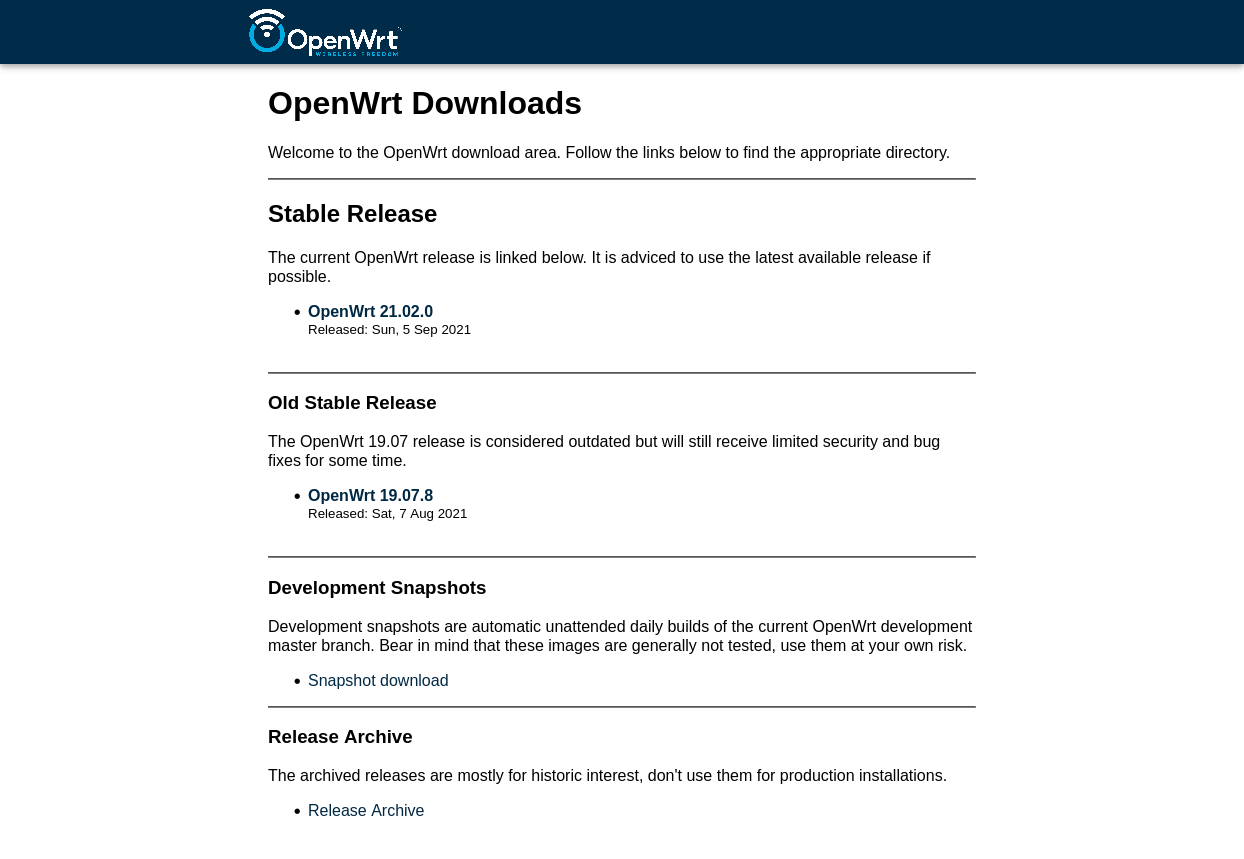
Paul (@aparcar) and I are working on a revision to a) look like his screen shot above, and b) subsequently include the Firmware Selector at the top of that page.
P.S. I'm pretty excited for the IB update that you (prematurely, according to you) shared. I think it will be incredibly useful and hopefully super popular!
Hi all, I recently wanted to add a download section to our README.md (most prominent on GitHub) but I'm unsure where to link it to. I personally would link it to the firmware selector since it's the easiest way to download firmware. Linking it to the download server is not super helpful since people would need to know what target and profile they need. Also no actual documentation is available there. Lastly it could link to the downloads wiki section, however that section seems a bit overwhelming since it covers multiple purposes, linking to packages, to building firmware, buildbot activity and lastly download statistics.
From these three options the Wiki seem the way to go, however the firmware selector is just one of many blue links on that page. What do people think about simplifying this page and focus on easy firmware download rather than offering all information that is possible? Looking at other download pages like Alpine, Debian or LineageOS it's always very simple to find where to download what. @tmomas@bobafetthotmail do you have thoughts on that?
IMHO if the link is called "Download" it should most directly lead to the actual download link/page (and not a wiki).
Speaking of, my dream download page would be a combination of the LineageOS (with vendors listed on the left in the alphabetical order) and twrp.me with the search bar up top, either of these controls should lead to the list of compatible downloads appearing in the middle.
If (under the search bar) we could have a bar with "most popular downloads in the last 24h, 1w, 1m, 1y" it may be even easier for new people to find downloads for most popular devices.
suggest addressing the metadata coherency issues first... giving users incorrect shasums or buildid's may be easy... but it's not the right way to do things...
I would link first the firmware selector and then the downloads wiki section for "more information", in the Readme on github.
I would also move the "Download OpenWrt firmware specific for your device" paragraph at the top of the wiki download page and be more stalwart in directing users to firmware selector first and foremost. Like with FULL CAPS or bold or other gimmicks like the infobox windows.