As we now have a proper logo that should reflect the Openwrt Project... Was thinking... Why not use that directly instead of the full Openwrt Text diagonal in the icon used for the pwa forum?
The diagonal Openwrt text is very small (i suspect even smaller in a 4k screen). Think the logo would works better and be more intuitive.
@Ansuel I agree - I'm still working on some of the graphics. As soon as I get a chance to create the logo graphics with a transparent background suitable for Discourse, I will add it. Still a WIP.
I made another pass at normalizing some of the images used for site branding. Feedback (mockery and/or derision) welcome.
@Hegabo - It turns out the image in the PDF document we are using as a base is not centered over the text to start with. It does however, make sense to use the logo without the text.
@thess
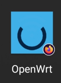
The logo for the app icon for android seems to be centred now, but I think we need padding/margin around the logo to avoid dropping the logo itself.
IMMV - On my phone (S10e) using Vivaldi browser, the app icon looks just fine. Vivaldi is Chromium based - the issue must in Chrome or are you using FF or ?? Do you know what image was being fetched for the app icon?
I doubt I can do anything about this specific case.
I don't, but it's one of the icons you just centered, because it was not centered earlier and now it's, except that it looks cropped.
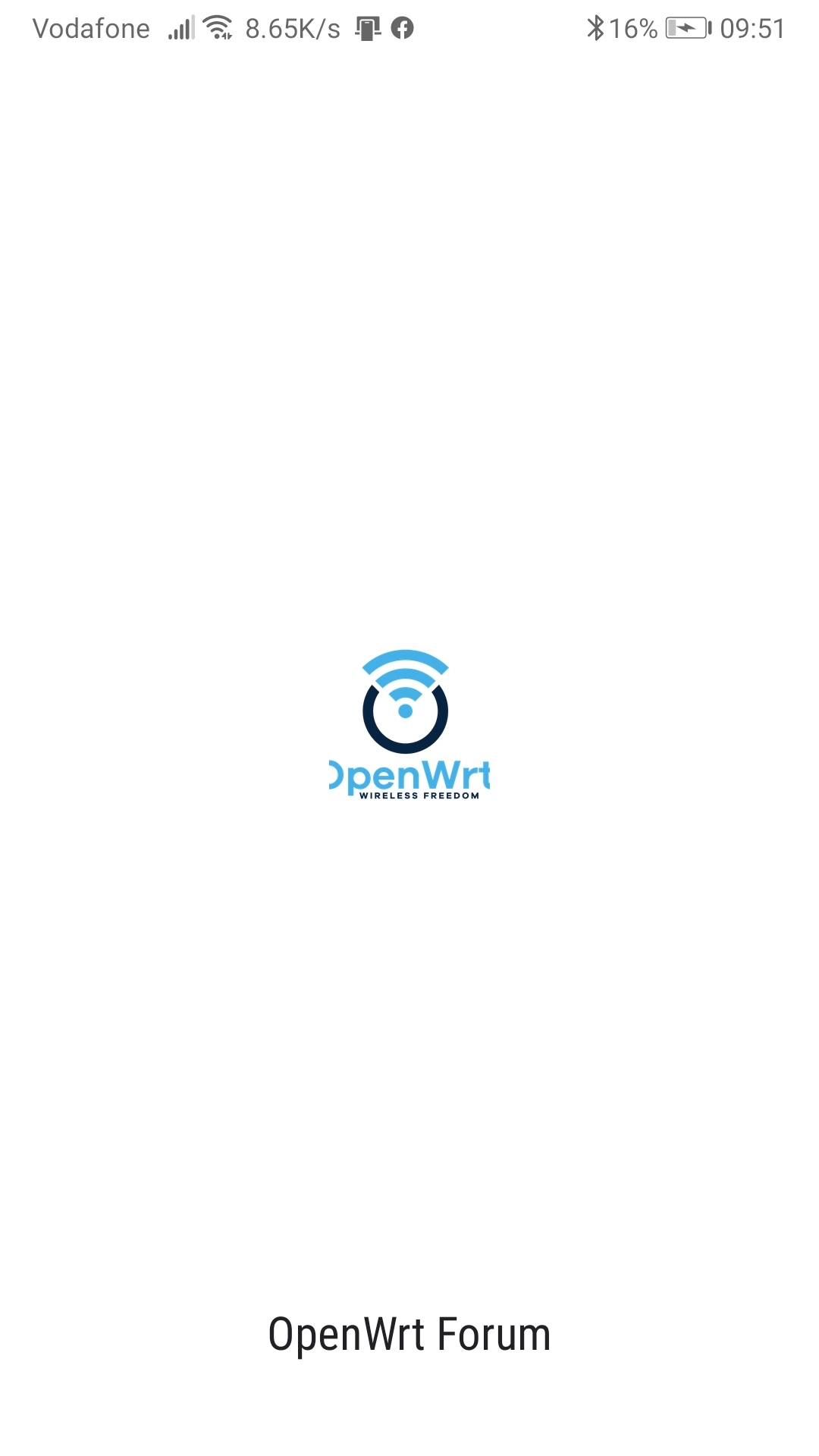
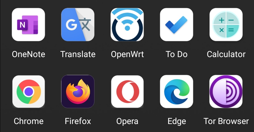
The image I shared earlier was of Chrome app. The one below is of Firefox
I also tried a different icon theme (a square one), and you se e in comparison to other apps, the problem is that there is no padding around the icon like the rest of the apps, so it doesn't look good on a dark background, and it gets cropped when in circle.