My version of the luci bootstrap theme.
Changed CSS code and added a background image.
Download & install instructions:
My version of the luci bootstrap theme.
Changed CSS code and added a background image.
Download & install instructions:
This is really quite beautiful. I will test it with my phone tomorrow to see how it looks on mobile.
I got a chance to test this today. On desktop, your theme looks absolutely gorgeous and functions great. I really like it.
I also tested it on my iPhone as well to see if it looks just as great on mobile. Everything seemed quite good except one issue:
Logout button gets pushed down a line and displays on the left side of the page under the Status menu button.
I assume the font size of those menu buttons at the top of the page just needs to be lowered a bit.
Thank you!
I tested using Google Chrome on a desktop and (almost) all bugs are gone for that view.
Mobile interface (portrait mode) has a few bugs, but they aren't annoying and everything works.
I'll add some CSS code for the mobile portrait view and post them as a new release on GitHub.
You’re welcome. Keep up the good work. It’s a theme that’s calming and visually pleasing on the eyes. So I will definitely keep checking out future updates.
This looks really amazing, and gave me ideas for a much better visual representation given the limitation of lua/luci.
Hi @wootje
If I can add something from myself, the theme has potential.
Pluses in my opinion:
Cons in my opinion:
Hey IceG,
Thank you for the feedback. I've thaught CSS coding myself, so the code won't be perfect.
A new release is almost ready:
I'm considering:
Update
Just uploaded a new release - v0.3
Improvements
Download
Thanks for sharing, tried on desktop so far and it looks nice!
Fonts (?) in refreshing button and Statistics ---> Graphs need some fine tuning...

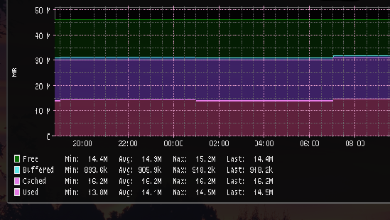
Statistics ---> Graphs are images (no text). I made them a little bit bigger and easier to read. That's all I can do.
I'll add "refreshing" button to my list.