The Mark as Solution  is rendering large in the top, middle of footer.
I’ve checked it accidentally scrolling a couple of times.
The Mark as Solution is rendering large in the top, middle of footer.
I’ve checked it accidentally scrolling a couple of times.
It shows like that also on Chrome for Android.
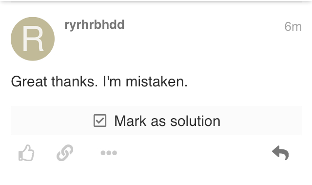
Looks intentional to me. Its actually a large button (see the light grey background).
Would it be possible to keep the text (so that people can see it, as that's the purpose I imagine), but have only the check box itself as the clickable (well, tapable) so avoid having people accidently taping it?