LEDE Table of Hardware: Styling

The raw bootstrap template shows the datatables (e.g. toh:start) in an unsightly way, i.e. w/o hor/vert lines.

I added some CSS to improve this:

  • Borders added
  • Zebra-striping added
  • Table headers colored differently than the rest of the table

Let me know what you think about this or if you have any improvement proposals.

https://wiki.lede-project.org/toh:start
https://wiki.lede-project.org/toh:views:toh_extended_all

This looks really good! I tested with Firefox (Win10 & OSX), Safari (OSX), Edge (Win10), and Chrome (Win10) (Update: Control-Reload flushed the cache on Chrome/OSX. It looks good everywhere.)

I have forgotten how to update the of the page - currently my browser tab says, "toh:start [LEDE Wiki]" It would be good to have it say, "Table of Hardware [LEDE Wiki]"

Other thoughts about appearance/screen space:

  • It would be good to make the Versions, Current LEDE Release, Current OWRT Release columns much narrower, to preserve horizontal screen space.
  • Could the input boxes at the head of each column be smaller as well (both vertically and horizontally) so they take up less space?
  • The table's bounding border looks good. What would it look like if the interior grid lines (between rows, and between columns) were gone?
  • Do we even need a "Current LEDE Release" column? What data would it contain now/soon/in two years?

Thanks!

I tried to achieve that, but to no avail. Tricky...[quote="richb-hanover, post:2, topic:51"]
Other thoughts about appearance/screen space:

It would be good to make the Versions, Current LEDE Release, Current OWRT Release columns much narrower, to preserve horizontal screen space.
Could the input boxes at the head of each column be smaller as well (both vertically and horizontally) so they take up less space?
[/quote]

I already tried to influence the width of the input boxes, but didn't succeed at all. Do we have someone out there with more than basic CSS skills?

Take a look: https://wiki.lede-project.org/toh/start
I like it better with grid.

The current LEDE release, same as in OpenWrt ToH.

Sidenote #1: List items are not preserved in quotings.
Sidenote #2 Damn, we have the same shitty problem as in the OpenWrt Wiki: Double dataentries.
Yesterday: 1133 devices in the ToH
Now: 1137 devices -> 3com + 4g systems are doubled. Damn!!!11 (sorry, but this is getting really annoying. I hoped that in a brand new wiki we wouldn't run into the same problem again :frowning: )

Scrolling like that is awful, and you know it. Admit it already. :grinning:
For the very least you need to place a scrollbar on the top of the table too.

Best would be to have the table in its own box with its own scrollbars, I know it was hard, I read the forum topic in Owrt forum.

Also, I think the horizontal space between cells could be kept smaller, like this most entries are lone words swimming in an empty sea. Also zooming does not change, everything is smaller but the proportions are the same.

Like in CPU mhz, it's a number then like "_______" of wasted space for lulz.

All full-length links are pointless, shorten them at once.

I'd like to see more things shortened up with symbols (example in the device type field, or the brand name with brand logo), or in a USB field you can show USB symbols for each port (different symbols for usb 1.1 2.0 or 3.0, maybe a small image of USB's actual symbol) instead of text, same for Ethernet ports (so you can shrink two fields in one, btw)

This forum only has these dumb icons for sound, so you get an example with them showing the amount of fictional "sound ports" on our devices:

one low sound port: :sound:

one loud sound port: :loud_sound:

four low sound ports: :sound::sound::sound::sound: or 4x :sound:

four loud sound ports: :loud_sound: :loud_sound: :loud_sound: :loud_sound: or 4x :loud_sound:

some of each: :sound::sound: :loud_sound: :loud_sound: or 2x :sound:/ 2x :loud_sound:

Yes these icons aren't the best as they are not different enough to make sure you don't read them wrong, as I said they are dumb icons, in the table we should use better ones.

All Yes/No/(weird upside down question mark, wat is dat anyway?) in the table would look much better (and waste less space) with icons like these :white_check_mark: :negative_squared_cross_mark: :question:

Note that I'm talking of turning a moon-sized database table in a pretty and easily-readable visual representation of the toh for human consumption, in a perfect world where adding what I ask is easy, fast and painless. So don't take it as an order or something, it's just a suggestion.

But yeah, the main takeaway is that while the actual database is ok, throwing a huuuge database table around (or even just a smaller table) isn't the best way to show information at people. Use text ONLY where you can't use an image instead.

Also, I take the occasion to state a probably known issue.
The USB field is inconsistent, you have some devices stating 1xusb2.0 and some devices stating "yes". Which is a bit weird. "Yes" what? 2.0? 1.1?

This is due to the bootstrap3 template we are currently using. My dislike for this template is growing more and more.
To show you the difference, I re-activated the template switcher in the upper right part of the pages; reload if it is not there, your browser cache might show you old data. See yourself how the ToH looks like with bootstrap3 and monobook.

I would like to, but that's not possible with the data plugin.
I'm still searching for someone who is able to modify dokuwiki plugins, especially the data plugin.

Usage of symbols i/o text:
Where would you like to see symbols? Please list them all, together with a rationale why a symbol is the better choice, and possibly provide a source for each symbol.

Sidenote: We discussed this approx. 1.5 years ago in the OpenWrt forum and came to the conclusion, that symbols need to be interpreted or explained. The more universal way is text i/o symbols.
You can see that this is not only the opinion of a few people in the forum by the fact, that even the creators of the dokuwiki translation / language plugin advise against the usage of flag-symbols and recommend instead usage of plain text.

If the 4 symbols should be smaller than todays text, they need to be very small.
So, instead of "4x 2.0" you want to show $number of very small symbols, that $user has to count and then interpret?
You have to convince me, before I buy this.

"¿" is a workaround for the inability of the data plugin to work with "?".
Should you want to filter for such a "we don't know" value, then you can do so, even if you don't know that this is ALT+168, you can copy and paste ¿ from somewhere else. Normally, you don't want to filter for unknown values.
When using symbols: How do you filter for :white_check_mark: :negative_squared_cross_mark: in the ToH?

Thoughts coming to my mind: "If you want to search for :white_check_mark:, you can easily do so by simply typing ': white_check_mark :' in the appropriate filter field at the top of the table. And for :negative_squared_cross_mark: values it's equally simple, just different: Type ': negative_squared_cross_mark :' " in the filter field." :smiley: (just joking)

You phrased that really wonderfully :o)
We have to face it: The ToH IS huge (even on a 27" monitor it needs 3.5 pages of scrolling to the right(bootstrap template)). And then there are the guys who want to browse the wiki on their 5" mobile phones.

I agree with you, that the bootstrap3 template doesn't combine well with the ToH, in terms of wasting space by making columns unnecessarily wide. Last week I tried to change the width of the input fields in the ToH headers via CSS, but failed, since the template seems to have something against this. In monobook however, the columns are smaller in the first place, no need to adjust anything.

"Yes" means:
We know that it has USB,
but we don't know if it's 1.0 or 3.0. (3.0 chosen for the rhyme)

I spent many hours checking the data for consistency, and I havn't always found a better answer, even not in the owners manuals. Feel free to update the dataentries if you have better information than "Yes". :slight_smile:

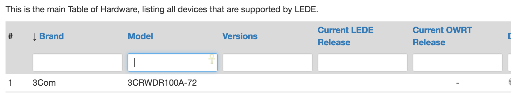
[quote="tmomas, post:5, topic:51, full:true"]See yourself how the ToH looks like with bootstrap3 and monobook.[/quote]Better with monobook, but there is still wasted space in many places, up to "___" per field. And monobook splits the longer names on 2 (or more) lines, which is kinda bad.

[quote]I would like to, but that's not possible with the data plugin.
I'm still searching for someone who is able to modify dokuwiki plugins, especially the data plugin.[/quote]I was thinking about an iframe (there is a plugin for iframes) and then showing another webpage (made manually or with a webapplication software) that pulls data from database and is more flexible than the (very very very dumb) docuwiki data plugin.

I'm pretty confident that even a bare-bones hand-made php webpage will be flexible enough to show a simple damn table from the database properly regardless of the wiki's theme, and will be better than current data plugin even if you don't go the icon route like I'm talking about below (that actually requires a dedicated webpage).

Docuwiki is in php so we have a php server already.

It might be more complex than just showing a table using a plugin, I'm not asking you to do it, this is again a "in a perfect world I would do like this".

I should be able to cobble together a simple php page to show the table and maybe to add icons too replacing text, btw.

[quote]Usage of symbols i/o text:
Where would you like to see symbols? Please list them all, together with a rationale why a symbol is the better choice,[/quote]Device type (per-device icon, this is a generic wifi router https://cdn0.iconfinder.com/data/icons/wi-fi/100/wifi-10-512.png this is a nas https://image.freepik.com/icones-gratuites/infrastructure-nas_318-11012.jpg ),
brand (brand symbol),
some yes/no fields (V/X icons like those shown above),
ethernet ports (different icons per 100Mbit/Gbit, can't find anything that has a clear difference between the two, so here is only a generic one http://image.flaticon.com/icons/png/512/3/3753.png ),
wlan (the b/g/n thing turned to an icon like the ones you find on router's boxes, something like this http://image.made-in-china.com/2f0j00jefQYzHMgvUw/802-11b-G-N-WiFi-USB-Module.jpg look at the top part),
usb ports (V icon for the yes or usb logo, this for 2.0 https://en.wikipedia.org/wiki/USB#/media/File:Certified_Hi-Speed_USB.svg , this for 3.0 https://en.wikipedia.org/wiki/USB#/media/File:Certified_Hi-Speed_USB.svg or an icon of the port, black for 2.0 and blue for usb 3.0 ),
serial (show an icon if yes, same icon grayed out if no, or no icon if no https://openclipart.org/image/2400px/svg_to_png/189942/Serial-port.png )
Jtag (same as serial, its own icon if yes, grayed out or no icon if no)

The rationale is the same for all, an icon/image improves readability for the table (especially from mobile), shortens longer fields, and limits reading errors, as an icon showing a serial port cannot be read as a Jtag regardless of the column, while a "yes" in Serial column can.
Of course the generic V/X icons have the same issue, so the most yes/no fields you can convert to dedicated icons, the better.

[quote]and possibly provide a source for each symbol.[/quote]I provided some examples above but it is probably pointless to get proper icons at this stage, consider that the conversion text -> symbol should be done by the ToH webpage as storing links to images in the database itself makes it useless for other purposes (which is bad), and I assume that the docuwiki plugin is too dumb to do it.

[quote]Sidenote: We discussed this approx. 1.5 years ago in the OpenWrt forum and came to the conclusion, that symbols need to be interpreted or explained. The more universal way is text i/o symbols.[/quote]The general idea is to use self-explanatory icons, not symbols. A good icon needs no explanation.

An icon occupies roughly the same 2D space but is a boxy shape instead of a line-y shape, it allows you to shorten longer text by sacrificing some vertical space.
Considering that i read records horizontally, i care more about gaining horizontal space than losing some vertical space.
Making an example with the device type:

currently it is "WiFi Router" (yes monoblock theme splits it on two lines but that's quite ugly)

You would replace it with an icon big as "WiFi" text only, like with a 30px icon from here (not as cool as the one above, just an example for size) http://www.softicons.com/toolbar-icons/free-mobile-icon-kit-by-happy-icon-studio/wi-fi-router-black-icon

[quote]So, instead of "4x 2.0" you want to show $number of very small symbols, that $user has to count and then interpret?[/quote]I did show the short version too, btw.

For USB/sata/serial/jtag and other yes/no things, icons won't shorten much but will improve readability.

I find

4x :satellite: (random icon)

is better than

4x 2.0

especially for devices that have more than one port type, say one with 2 usb 2.0 and one usb 3.0

2x 2.0/ 1x 3.0

vs

2x :closed_book: / 1x :green_book:

The icons are easier to read here. (again random stuff, only important thing for the example is that they need to look different)

[quote]"¿" is a workaround for the inability of the data plugin to work with "?".[/quote](facepalm for the plugin)

[quote]When using symbols: How do you filter for :white_check_mark: :negative_squared_cross_mark: in the ToH?[/quote]In a icon world, filtering would happen by using a drop-down menu with the same icons. Click click. Also mobile friendly.

For selecting devices with more than one port you place a dedicated option in the drop-down menu.
For ethernet for example most people will look for 100Mbit, gigabit, for devices with 2+ ports (100 or gbit), for devices with 4+ ports (100 or gbit). That's 6 entries in the drop down menu.

In the drop down you can also show some text besides the image too (maybe for brand name or something), but this text in drop-down menus can also help explaining the icons without wasting space in the table (if you can't use 100% clear icons).

I know you'll tell me that dumb plugin is probably unable to deal with it, I'll answer you that even a dumb PHP page can show decent drop down menus easily.

[quote]Feel free to update the dataentries if you have better information than "Yes". :slight_smile:
[/quote]My point was that "yes" is unclear as it isn't consistent with the other fields (also screws up searching).
I'd have written it like "1x¿ 1.1 or 2.0" or "1x¿ 2.0 or 3.0" , so you can still get that if you search for 1.1, 2.0 or 3.0 or whatever.

Oh, that's a NAS? I thought it looked like a USB powerpack. Really.
Icons need to be interpreted, and not everybody around the whole world has the same interpretation.
They need to be explained.

How will telephone ports look like?

Again, text doesn't need to be explaind, while the icons do. What does green, what does red mean?
Imagine the above example with the graphics from wikipedia you proposed above.
Think of a device with 4 USB ports. I'm still not convinced that this will make the usage of the ToH easier.

We should try this out in the LEDE demowiki, once @Martin Tippmann or $someone_else has set it up.

Will there be many people accessing the ToH via a mobile phone?
I would like to see statistics of the wiki showing the screen resolution and other data related to screen size.

To be honest: I don't care about this messing up the searching. If the manufacturer of the device doesn't feel the necessity to provide this information, then I don't care that his device doesn't show up when filtering the ToH.

Looking at the ToH filtered for USB = Yes https://wiki.lede-project.org/toh/views/toh_extended_all?datasrt=availability&dataflt[USB%20ports_*~]=yes

  • 38 devices in total
  • 9 of them still available, thats roughly 1.6% of all devices with USB in the ToH that you will potentially lose in your search, i.e. 98.4% are shown. I can live with that. We have fields with worse data quality.

No feedback on the iframe idea? I thought it would have more appeal than that.
It's not just for the icons, it should avoid the need to hack the data plugin to get it to render a decent text table.

I see you are reacting very defensively, my post wasn't intended as an attack on you or your work, but just as my own opinion on the matter.

[quote="tmomas, post:7, topic:51, full:true"]Oh, that's a NAS? I thought it looked like a USB powerpack. Really.[/quote]That's an example I pulled up in 10 minutes, please bear with me.

Finding good icons is a very time-consuming process, I'm not doing it unless there is some good chance I'm not wasting my time.

[quote]How will telephone ports look like?[/quote]The usual icon for telephone is the :telephone_receiver: (or similar) Or if you mean DSL ports you just write "DSL"

[quote]Again, text doesn't need to be explaind, while the icons do.[/quote]Heh, all the "yes" need an explanation actually. They need to stay in the right column to mean anything (yes to serial/jtag/whatever). The "Yes" can be read wrong if you read a "yes" from the wrong column.

Also the plain numbers (for ports, for ram/flash/whatever) and quite a few links need to be "explained" by the column.

[quote]What does green, what does red mean?[/quote]Again an example to show how with two different icons it's easier to see at a glance that there are 2x red books and 1x green book in there instead of reading, telling the difference between the 2x which is a multiplier and the 2.0 which indicates USB 2.0.

[quote]Think of a device with 4 USB ports.[/quote] As I said, we need to find a nice and clear icon, then it will look like 4x :satellite:

Consider that large part of the reason the ToH is still relatively readable with text is because the data plugin puts large amounts of space everywhere, if you bunch everything together without wasting like "____" per field you start having reading issues in some areas.

And imho wasting space like the plugin is doing atm is not a very good idea either, as to see the more important fields (not the whole table) I still need like 2 screens on a desktop PC (and I have a large fullHD screen).

[quote]Will there be many people accessing the ToH via a mobile phone?[/quote]Not in its current incarnation for sure. The ToH does not fit my PC's screen, why you think someone is crazy enough to try to look at it from a mobile device?

I'd personally find a mobile-friendly ToH useful as it can be called up while shopping or if you see something when in the physical world and you can't just open a laptop to see if $device is supported or not.

I printed it on paper and left a copy in my car currently, but I'm not fond of this low-tech solution.

[quote]To be honest: I don't care about this messing up the searching. If the manufacturer of the device doesn't feel the necessity to provide this information, then I don't care that his device doesn't show up when filtering the ToH.[/quote]The ToH is not a good place to express your spite towards the manufacturer, please try to keep in mind that the main target of the ToH is us, and if you place stuff that is inconsistent or isn't searchable you are doing a disservice to us.

As you can see by switching the dokuwiki template: It is not the data plugin that produces BS, but rather the template.

That's due to my history with the data plugin. I know where we are coming from (a wiki without the data plugin), and having the current ToH is better than everything there was before.

Sure, the data plugin has it's weaknessess and isn't 100% perfect. However, it is easy to implement and working reasonably well.
Implementing a tailored new solution would be nice, but that would require plugin coding, which is out of my scope and would be a longterm solution. A demowiki for experimenting without the fear of breaking the productive wiki would be highly appreciated.

I think I have to clarify something: Currently, I only have 2 ToH variants implemented

These are the extremes.
As you can see here https://wiki.openwrt.org/toh/views/start, there are many different ToH versions possible, tailored to the needs of the users.

Having said that: What are your needs? Which fields would you like to see in a ToH variant and for what reason?
Instead of describing here what needs to be in and what not, you can just create a ToH variant yourself, starting with the extended version (it includes most of the available fields) and throwing out any column that you think are not necessary.

Showing only the columns that are needed to answer a specific question greatly reduces the needed screen width and makes it much more readable.

The ToH views shown in https://wiki.openwrt.org/toh/views/start have mostly been created by myself, in the absence of helpful user feedback.

I see that you are very motivated, full of energy and ideas, and I really like the ongoing discussion. I will be happy to implement new ideas - within the current constraints of the dokuwiki + data plugin.

I'm not per se blocking anything beyond those constraints, but as explained above, creating a "ToH V2" needs time and people able to do some programming.

[quote="tmomas, post:9, topic:51, full:true"]Implementing a tailored new solution would be nice, but that would require plugin coding, which is out of my scope and would be a longterm solution.[/quote]With an iframe (there is a iframe plugin already) there would be no need to code plugins but just to code a standalone php webpage that works with the database and shows the table, then host it on the server and point the iframe plugin to it.

I'm eventually going to do some tests locally and see if I can whip together a php page that can be used like this.

[quote]Instead of describing here what needs to be in and what not, you can just create a ToH variant yourself, starting with the extended version (it includes most of the available fields) and throwing out any column that you think are not necessary.[/quote]Hm, will add the views I feel are required, ok.

One bit of relief on styling of the ToH in Bootstrap...

I think the input fields are the culprit. Their width is set to "auto"; changing it manually (in Chrome Dev Tools) to a width of 98% causes the fields to be as wide as they need to be to accommodate the text in those columns. Specifically:

Current CSS:

@media (min-width: 768px)
.form-inline .form-control {
    display: inline-block;
    width: auto;       <-- "auto"
    vertical-align: middle;
}

Change to:

@media (min-width: 768px)
.form-inline .form-control {
    display: inline-block;
    width: 98%;      <-- exactly the same, except "98%"
    vertical-align: middle;
}

This, of course, makes the header look somewhat worse, but as my buddy used to say, "One insurmountable hurdle at a time." :slight_smile:

1 Like

Go iFrames!!!

I would really like to see the table header NOT scroll off the page. I do not think it can be done any other way from what we went through last year.

Is there some way to solve the stretching, and resulting wasted space of the nav column on the left? Once the text string "Welcome to the LEDE Project" goes to a single line, the TOH border should stop moving to the right. It keeps getting wider and wider on multiple monitors.

Regarding Mobile, you can copy the TOH to Excel, and then upload it to Dropbox. I do this with a few things, though nothing this wide.

Anyone notice how monobook loose the LH nave panel? I think the lines make it easier to read, especially when there is wide columns with little data.

@richb-hanover-priv Coool, see https://wiki.lede-project.org/toh/views/toh_extended_all
:slight_smile:

I jus noticed that this seems to break the pageedit mode (Minor edit checkbox is now inside the summary input field):

Sigh... But it doesn't work in Chrome... At first, the columns are all different widths as desired, but as the data comes in for the rest of the ToH rows, the columns all snap to the same width again.

I wonder if CSS that sets the width to 98% for all <th> input fields could do it. That might also solve the broken pageedit. (I don't have time right now to try it, but perhaps this would do it...)

table th input {
   width: 98%;
}

It does :slight_smile:
Reload / clear browser cache. The CSS get's cached too.

After clearing the Cache in Mozilla 49 it works. Also works in the crusty old IE 9.

For me, too, on OSX in Chrome. It seems I have to Control-Reload, then quit the browser and re-open.

I eased the process of creating your own ToH version by implementing a namespace template for /toh/views/.
Complete the link with your toh name and see yourself: https://wiki.lede-project.org/toh/views/ <---- enter-your-toh-name-here

I doubt that there will be many personal ToH versions (apart from the ones to be c/o from https://wiki.openwrt.org/toh/views/start) and that the template will be of any big use, but I recently started to like namespace templates a lot :slight_smile:

Comments are welcome!

Would you please add another 3 important columns to the overview table: CPU, memory, flash? As these 3 columns are very useful for router buyers to screening target. Previously, these information shown in the overview on Openwrt toh, but now hide from the overview and only available in details pages, it is really inconvenience.