I am not sure what it means. It is not as intuitive as the graph of Windows Task Manager. Does this mean that the network performance is bottlenecked by the CPU?
Well, it is the windows task manager which is not intuitive. Because you can't see over 100% with windows task manager. So there is no way of you to know how much you would need to satisfy the demand. In Linux the average actually includes the demand.
For example I have load 100% on Windows, how many cores I need to have a reasonable load percent? Hmm no way of knowing on Windows. In Linux my load is 1.4 well that means if I had 2 cores that would have been enough. If load was 3.2 then I would have needed 4 cores to satisfy it. (although I expect this does not go quite linearly).
Running LuCI "actively" and real-time graphs is a significant load on a slower, single-core MIPS processors. You may or may not have any problems with CPU power for routing, depending on your bandwidth and what you're doing with the traffic, if anything.
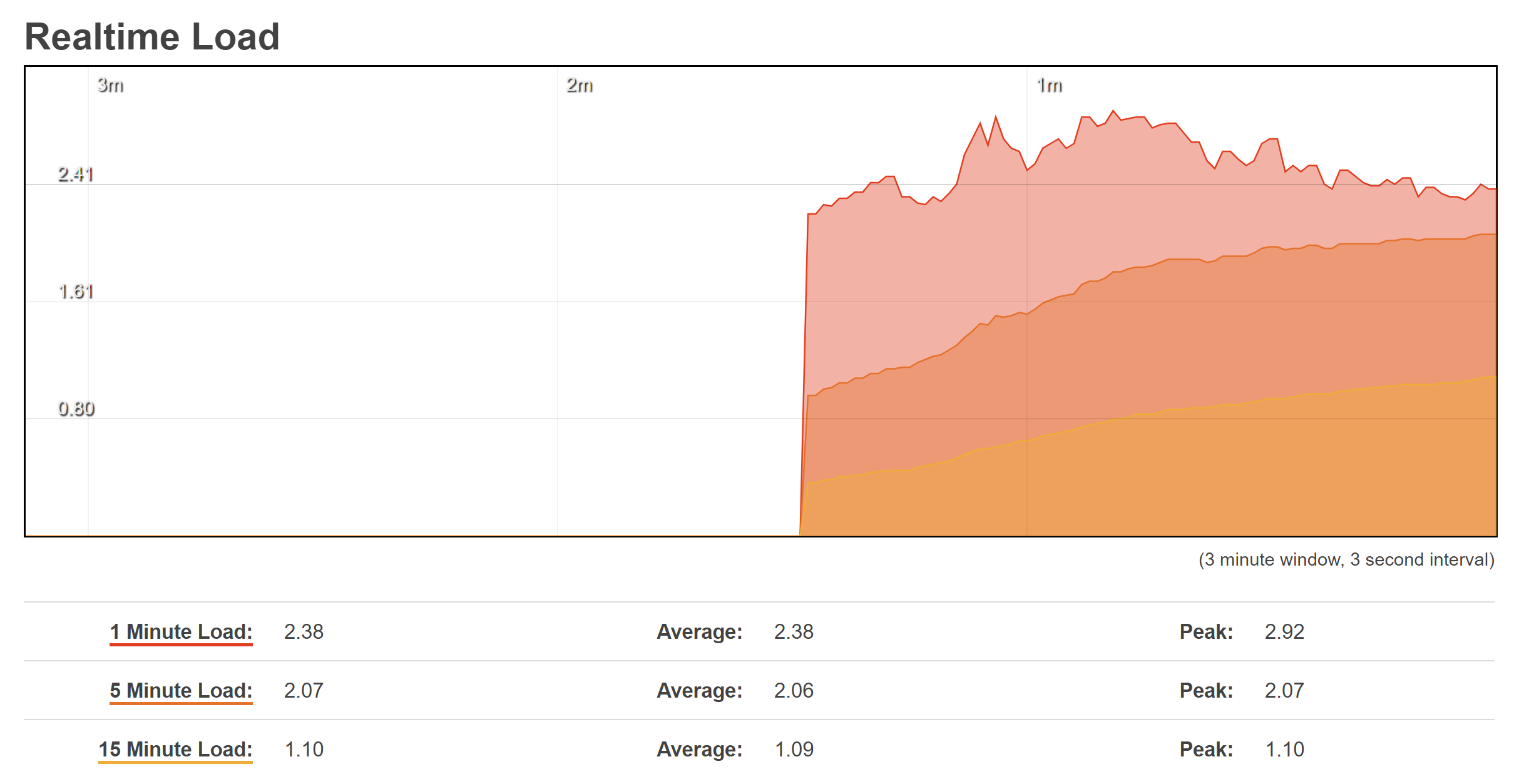
The numbers are Linux "load average." The exact interpretation of it is the subject of controversy, but it is generally accepted that over 1.0 on a single-core CPU is heavily loaded.
Running top on the command line is a more accurate number because as noted, LUCI itself will use a lot of CPU.
/*
 * kernel/sched/loadavg.c
 *
 * This file contains the magic bits required to compute the global loadavg
 * figure. Its a silly number but people think its important. We go through
 * great pains to make it work on big machines and tickless kernels.
 */