@jow. I think you are right. I expected your project luci-ng completed. But I think react is easier than angular. 
current luci source is here https://github.com/openwrt/luci
I also think changing the LEDE Default Theme is a good idea, as it'll also separate LEDE a bit more from OpenWRT. luci-theme-material is a good choice, since it looks modern, it's optimized for mobile, and it kinda matches the theme found on lede-project.org webpage (very LEDE like)... all pluses. Efforts to fix up this theme is probably a better use of time, instead of creating a brand new theme/system from scratch before the official release launch. I'm sure there are more important things to do before the launch. Making a new theme/system can be done once they're finished.
That said I've included some screenshots of the modifications I made to luci-theme-material when I first installed it on LEDE, which was just changing the colour scheme (the blue on the left) and adding the LEDE icon, adding more ipv6 functionality (luci) and a couple of small bug fixes with misformed URLs.
If the only complaint again luci-theme-material is that it includes a full jQuery min (jquery.min.js, 93KB) then maybe the efforts should be to just reduce the resources of the theme as much as possible, clean up the colour scheme in the CSS a bit, and call it a day? I see it's using jQuery 1.11.3. Efforts could be spent upgrading the jQuery to the latest slim build (jquery-3.1.1.slim.min, 68KB). Which would save some disk space, and maybe resources. Even upgrading to the 3.1.1 full (min) build is 83KB, and would save some diskspace.
As shown in the screenshots, all the luci-app-* and such work just fine with the theme. Comparing these screenshots to metai's new theme (above), it looks like they will be very similar in appearance. Is he using jQuery too?
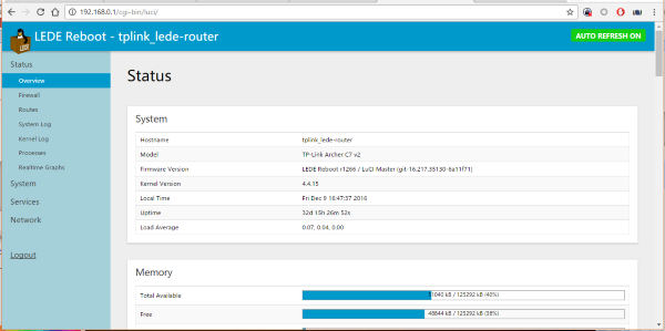
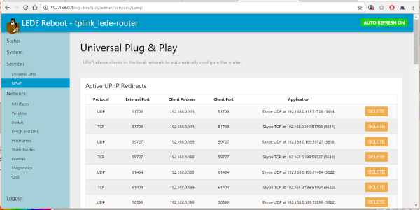
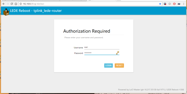
And on Mobile, it looks very good and very quick. My icon adding made the title misplaced but easily fixed.
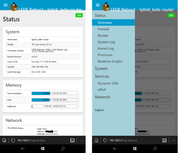
EDIT: Sorry combining all the pictures into 1 post now.
Which actually brings us to another subject in Luci -- OpenWrt vs LEDE monikers and links to OpenWrt.org vs lede-project.org.
@jow, @hnyman -- I'm not fully aware of the current status of OpenWrt/LEDE re-merging but unless both projects information is going to be available from a single URL, I don't think it makes sense to have a link to openwrt.org from every single page of Luci (bottom right corner, the version information is linking to openwrt.org), so at what point in time would it make sense to overhaul luci-mod-admin-full and themes to change the links/labels from OpenWrt to LEDE?
I can submit PR to show either OpenWrt or LEDE moniker based on information in ver.distversion in luci-mod-admin-full and showing proper links in the currently available themes footer. Should I go ahead with the changes, or are the projects to be merged sometime soon and there will be a single URL/moniker?
Changing default theme close too the first stable release sound not like a good idea. There are documentation and screenshots in doc. that need to stay in sync with the current stable release. Getting front end ready, allowing the users to change it at will on it other hand seems like a better idea to me. I think Kodi.tv did a good job when they updated and changed the default theme. Quite painless transition. New interfaces introduced like this - https://kodi.tv/a-new-webinterface-called-chorus2/
@steinmb What you say makes some sense, definitely.
But I don't think you'll get more or different information from a theme then from another one. It's just the same information reshuffled in a different way with different colors. Isn't it?
With OpenWRT wiki and fora I often had to "reverse engineer" from CLI to web UI or sometimes the other way around.
I still don't understand why (I mean "the real reasons for"™):
- not focusing on effectiveness more than "responsiveness";
- wasting all that screen real estate for nothing;
- not using higher contrast vs low contrast;
(1) The responsiveness is an illusion, especially with smaller boxes w/ small RAM and CPU capacity. Even if your web UI page responds faster (thanks to local js), the target box will need time to make it effective. The heavier the load (specific processes and/or web frameworks and runtimes), the longer the actual time.
(2) Readability is one thing, spreading the information all over a screen is "not good"™, especially if you need to scroll the page when you could avoid it. And I foresee more and more people using small screens to access those web UI.
(3) The use of "50 shades of gray over light blue/gray/pink" is something you can define as "fancy" or "chic". Surely it's not "readable" or "usable". I am not saying to go back to bright green on real black, but anything that gets as close as possible to black on white would really help a lot. Even this nice forum is using very low contrast in some parts with stuff appearing and disappearing with hovers. Nice, but far from being effective and productive.
As an option, there could be an SSH-driven local client to allow for fancy and stylish graphical UI with the very minimal burden to the target. In the end the web UI is nothing more than a graphical front-end to the underlying CLI.
And with SSHv2 protocols being available for at least Chrome and Firefox, that could even be a browser add-on.
To be honest I'm not 100% sure how big the changes would be. It just seemed like a little late in the development to introduce this. Do not have any strong objection against the change it self.
I'm all for getting rid of stuff that break readability/accessibility for everyone (WACAG 2.0) - There is always strong opinion on how stuff should look but but I do not think anyone can defend bad accessibility (except marketing people). Does this exist as a bug/feature req in the issue queue?
Why late? Is there any deadline I am not aware of?
If we keep the web UI base technology as it is now (aka LuCI, which seems to me to be the case), it'd be little more than touching a few static files (HTML and CSS afaiu). Or just embracing the original openwrt LuCI theme.
And even if you were talking about the "SSHv2 driven UI", that wouldn't impact any existing stuff as it'd be all external.
If you are talking about the screenshot thing, I have done a quick sampling in the current wiki and haven't seen any, not even for "LEDE firmware upgrade (LuCI or command line)".
The original OpenWRT wiki, on the other side, uses almost always screenshots with the openwrt LuCI theme.
Of course I could be completely wrong!
Did you give up on this? Of all the mockups so far I've liked yours the most.
Could you link any work in progress you have?
Yes, I stopped working on it.
[quote="metai, post:53, topic:412, full:true"]
Yes, I stopped working on it.
[/quote]Awwww........
Don't be sad. Judging from this thread, every possible approach is already in the works. You should soon have about half a dozen new web interfaces to choose from.
(Sarcasm detected)
So this got sent to the ML. https://apollo.open-resource.org/mission:log:2017:01:08:darkmatter-a-new-theme-for-lede-openwrt
Ignoring my general boner for dark themes it seems to tick all the right boxes for people. Mobile UI looks good and it's dense.
I agree with @weedy about the dark themes.
In this case it think it's little more than a few CSS edits away from my ideas.
I also like this. But since it's build upon luci-theme-material, it's just an upgraded version of that. And has the same problems Material has (a full jQuery in it of 1.11.3, same version as material). I would have liked to see it updated to the newer "slim" version (jquery-3.1.1.slim.min, 68KB).
Also the CSS file in darkmatter is 125KB (compared to material's CSS file of 28KB). Which effectively doubles material's project size (if physical size is an issue).
I'm sure they added a lot fixes and such to the CSS. I'm not too sure if why the CSS increased 5x compared to material. That said, they look very similar to me with just a new colour scheme.
I still think sliming down luci-theme-material with the new jQuery slim.min, changing a few colours in the CSS, and focus on reducing resources on that may be the way to go. That said, I like both Apollo and Material. They look similar (minus colour scheme) to me.
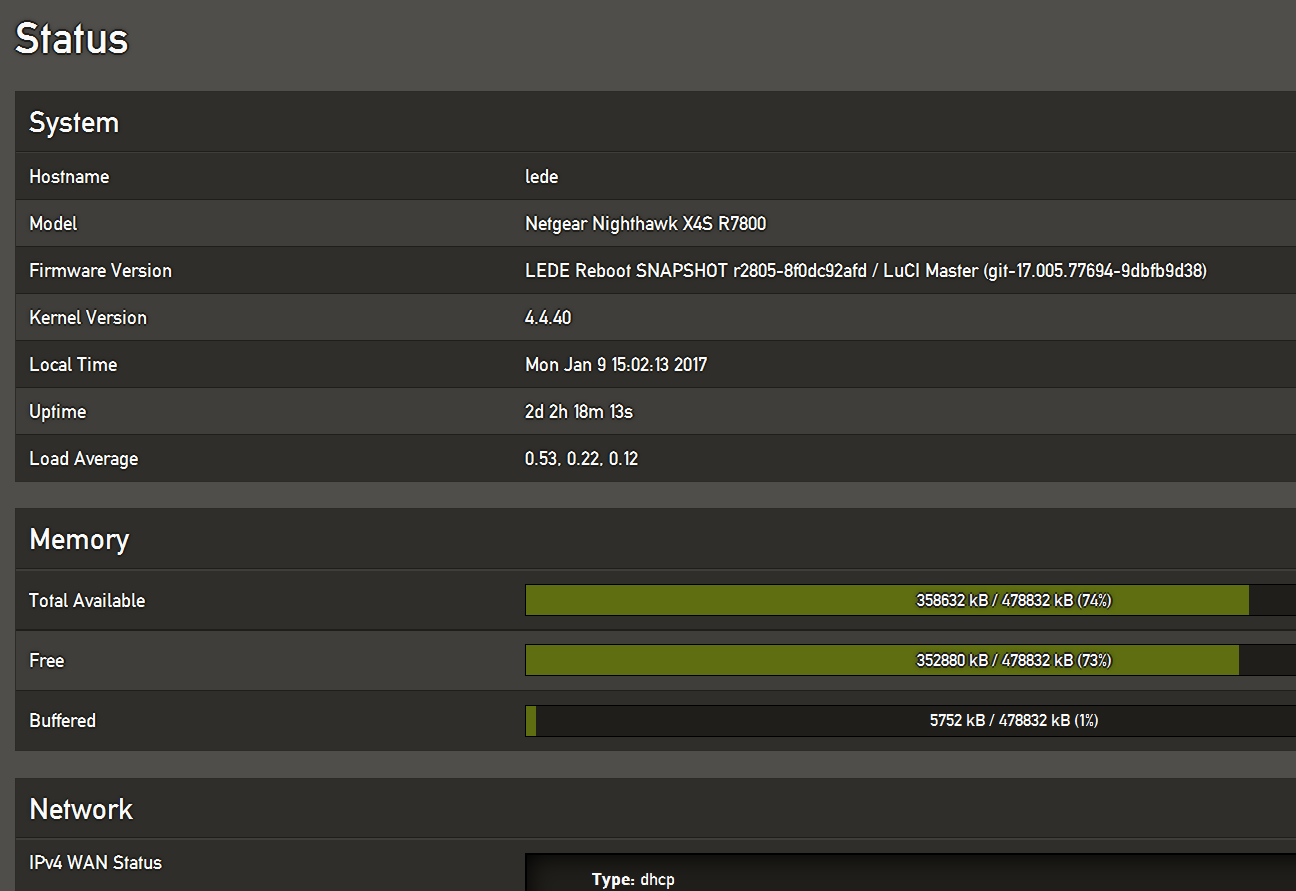
Darkmatter seems to have been compiled with non-standard toolchain (uClibc instead of musl), so installing the IPK package gives dependency failure in LEDE.
But opkg install works with an override "--force-depends" as the package does not actually contain any compiled binaries":
opkg install --force-depends luci-theme-darkmatter_0.1.77-1_all.ipk
That's because a bunch of images are "embedded" into the CSS (via data URIs which calls for base64 encoding, and enlarging file sizes by 33% is a curious decision when space is sparse). Also it includes a whopping 142 kB of font files (where the 14 kB WOFF version would have sufficed). It looks like someone had some idea about somewhat modern web development, but didn't have space constraints in mind at all.
I know, I know, I shouldn't harp on what I failed to do (yet). But IMHO this is what the Web UI doesn't need: A theme piled on a theme piled on a framework piled on old code, just to give it a different color scheme. But, eh, to each their own.
All these feedbacks lead, in my opinion, to a single direction.
Slim web UI with high readability colors and compact layout.
And if we keep useless clicks away, that would be another
great achievement, IMHO.
And, by the way, I'd like to change this forum theme.
This is really too pale to be read and clicked upon...

... until you hover onto them. Those three dots hide some extra message option icons...

Just two! Why hide, then?

Why use grayish ink and not "plain old black"™ (and red and green)?
You should adress this to https://forum.openwrt.org/c/site-feedback, or maybe @jow, since he has taken care of many css issues of the forum in the past.