The solution for the LEDE forum may not be the CSS from https://github.com/karissa/discourse-minimal, but a specifically tailored one.
It's nice to see that you can influence the appearance of discourse this way, however, I find it annoying that I have to in the first place.
@bobafetthotmail I think the concern is that Discourse takes some getting used to. (I like it a great deal, and it has fantastic features for both readers and admins, but it looks different from a "traditional" forum like phpBB, punBB, vBulletin, etc.)
@everyone I find it disconcerting that the 'discourse-minimal' site doesn't point to a demo/example site so that we can see how great it looks/try it out.
[quote="richb-hanover-priv, post:3, topic:91"]I think the concern is that Discourse takes some getting used to. (I like it a great deal, and it has fantastic features for both readers and admins, but it looks different from a "traditional" forum like phpBB, punBB, vBulletin, etc.)[/quote]Really, it's a forum. Buttons or info panels are in a different place, but the same buttons you have.
I personally like the modern and mobile-friendly look of Discourse.
The proposed thing is removing stuff you would have on most forums too (if you remove "new" and "unread" buttons I'm going to be very upset, btw), with the stated goal of making the forum easier to use for people "that can only use facebook and email" (as if their interface was easy to use, anyway).
Seriously, LEDE isn't targeting those kinds of people, and I'd rather not dump features because some people might not be able to operate a modern forum.
Also, vBullettin is and has traditionally been very very bad in my experience (while also closed-source).
@bobafetthotmail - I understand your reasoning but please try to avoid the strong language I'm also getting more used to Discourse every day and can hardly imagine the alternatives anymore.
What I can look into is making the CSS layout a bit more compact, I guess this could already help.
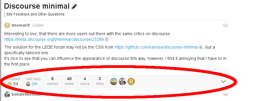
Personally I'd also vote for removing the topic stats bar, not sure how useful it really is:
Another item which can probably go (at least with our current amount of sections), is the grey "all categories" selector menu - it is redundant and ugly. It also is too prominently placed as first item in the menu row when considering the function it serves:
[quote="jow, post:7, topic:91, full:true"]Personally I'd also vote for removing the topic stats bar, not sure how useful it really is:[/quote]Mixed feelings. It does show some useful info like when the thread was created, last reply, replies, views, users (I know it is shown already in the page with the thread list).
While the number of links, the user avatars, and the whole pull-down menu are completely useless imho.
[quote]Another item which can probably go (at least with our current amount of sections), is the grey "all categories" selector menu[/quote]Ok for me.
Ok so what about just keeping the metadata items (basically the first half of the bar) and hide the rest? Then we can reduce the height to just one line and even move it to the top of the first post, beneath the topic title.
[quote="jow, post:9, topic:91, full:true"]Ok so what about just keeping the metadata items (basically the first half of the bar) and hide the rest? Then we can reduce the height to just one line and even move it to the top of the first post, beneath the topic title.[/quote]Sounds good.
(would also be possible to reduce a bit the minimum-15-chars per post limit, to like 5 or so? I cannot post a "sounds good" without adding buffer text)
 I'm also getting more used to Discourse every day and can hardly imagine the alternatives anymore.